
BlackRock Voting Choice
An industry-first SaaS solution for retail investors to participate in ESG voting decisions inline with their ethical values and policy governance preferences.

The Office Group, in partnership with Blackstone, stands as the United Kingdom’s foremost provider of flexible workspace solutions. Presently, TOG operates a network of 42 buildings throughout the UK and Germany, catering to a rapidly growing and diverse membership exceeding 25,000.
In a transformative move in June 2017, Blackstone Real Estate Partners Europe V (“Blackstone”) acquired a controlling interest in TOG. Blackstone’s vision was to propel TOG beyond its digital infancy into a phase of maturity.
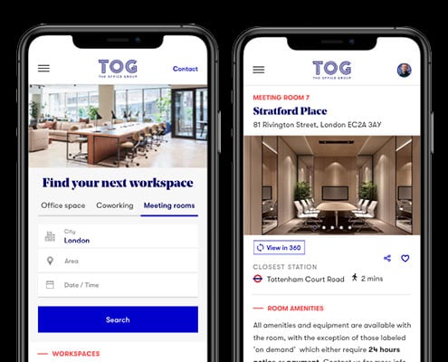
Central to this transformation was the overhaul of the TOG website. The existing site, built on WordPress and managed by an external agency, proved wholly inadequate for the task at hand, necessitating a comprehensive ground-up redesign and migration to a different platform.
On this project I worked as Head of Digital Experience. I took a hands-on approach to research and redesign the TOG website, working closely with another researcher who reported to myself. Additionally, I collaborated with a Product Manager and the Popcorn engineering team based in India to execute the project.
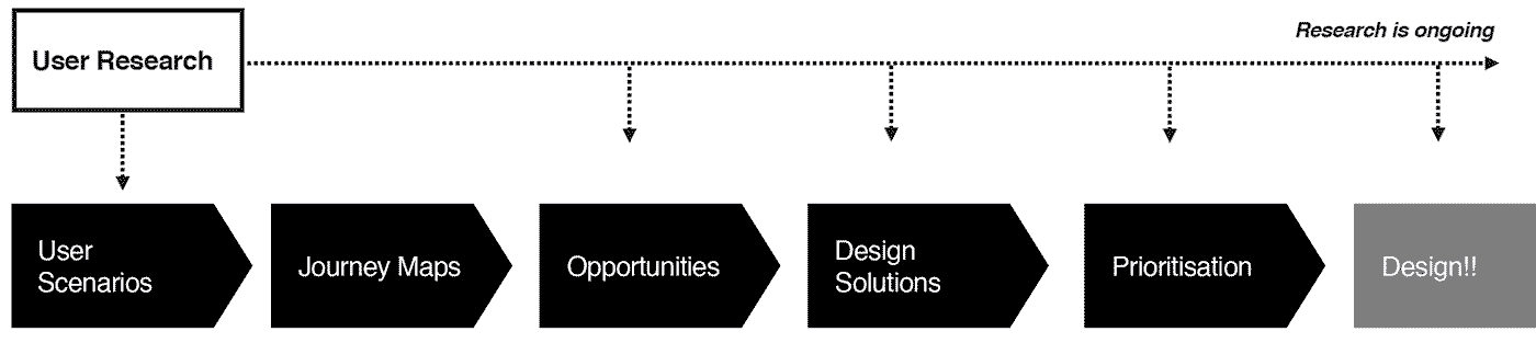
In the absence of pre-existing insights, my starting point was comprehensive research. Following the standard practice, I initiated discovery workshops engaging with the Contact Center, Sales, Building, and Marketing teams. These workshops were instrumental in gaining a deeper understanding of typical Office and Coworking customers and uncovering key assumptions, subsequently debunked through research.
To ensure comprehensive insights, I partnered with a user research participant recruitment agency. We conducted three in-depth interview sessions with both existing and prospective customers. Subsequent to these sessions, we held an affinity mapping workshop to identify recurring patterns emerging from the information gathered in the interviews.
During the customer interviews, I assigned participants the task of demonstrating how they could locate office spaces on the TOG website and its competitors’ sites. To enhance the collection of compelling evidence for this task, I used eye-tracking technology (as seen in the video).
The insights derived from these sessions proved to be enlightening for many stakeholders who had previously favored retaining the old website.

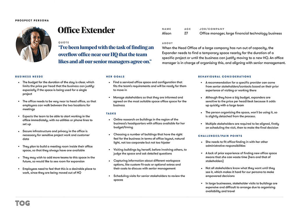
Responsible for finding temporary overflow space for a growing company.

A CEO of a small-to-medium-sized company in search of a larger and more prestigious location via a broker.
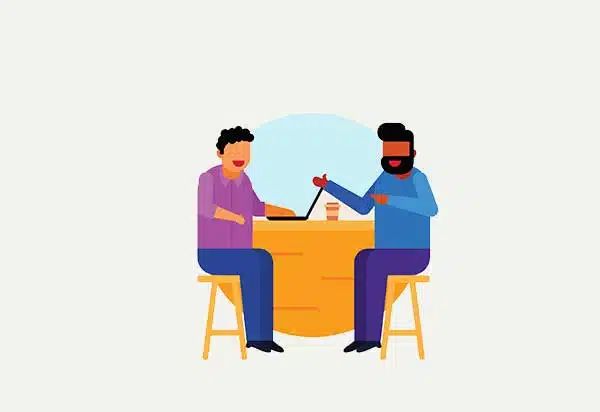
In the process of establishing a business, requiring a professional space to meet clients.
Finding a space for others is a stressful process for the inexperienced.
Office locations have typically been decided prior to starting the search.
Culture, style and guests-experience must be appropriate to the Business and clients.
Customers would love/discard an office by looking at just one picture.
Information that is not clear and honest creates frustration and distrust.
When the Head Office of a large company has run out of capacity, the Expander needs to find a temporary space nearby for the duration of a specific project or until the business can justify moving to a new HQ. An office manager is in charge of organising this, and aligning with senior management.
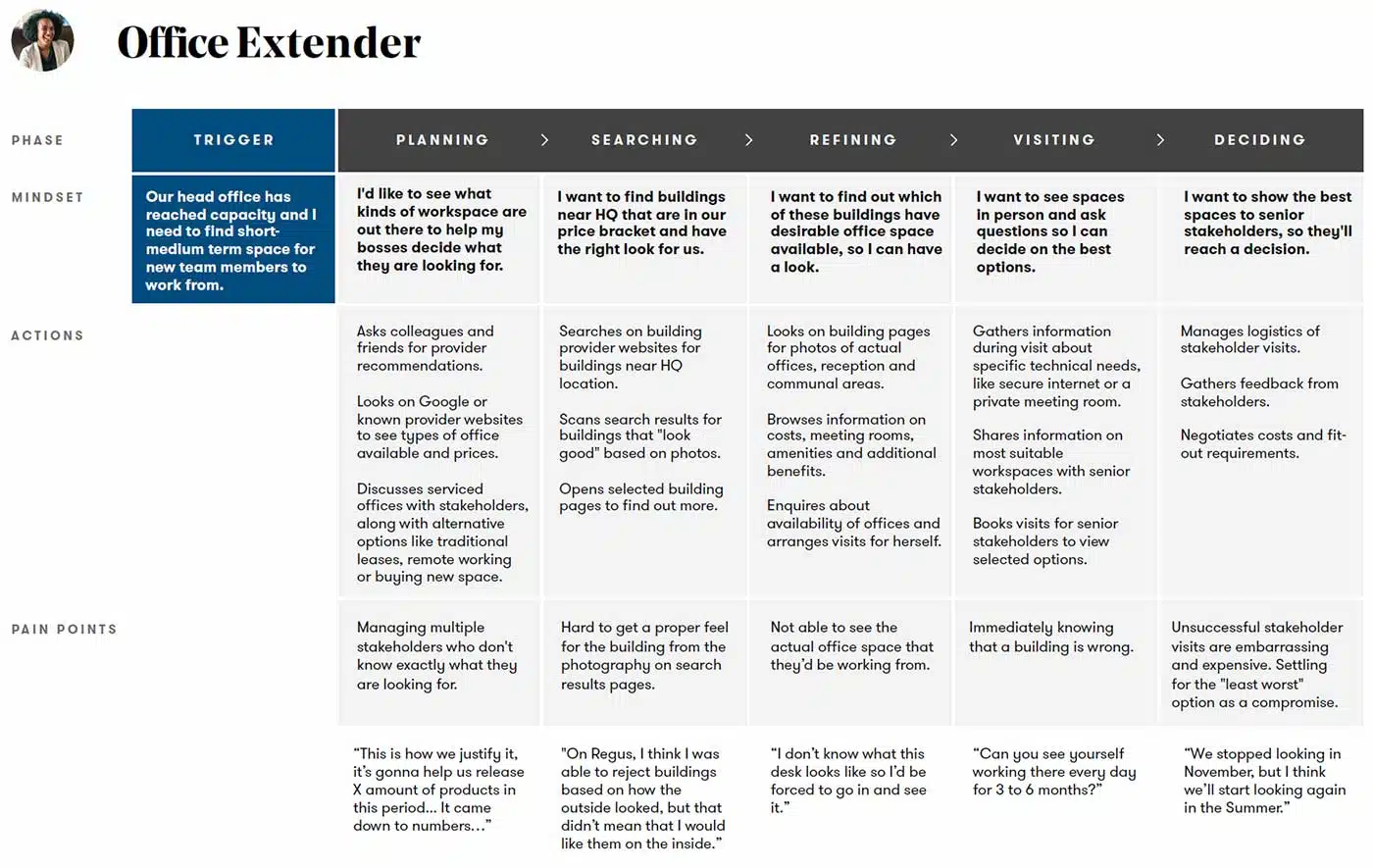
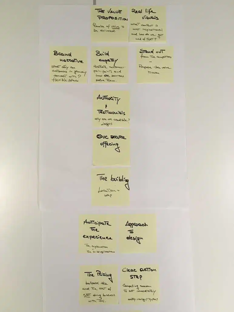
I created three Customer journey maps, one per each identified persona. I used this artifact to visualise the process that a prospective office space customer goes through in order to accomplish his/her goal. And for understanding and addressing customer needs and pain points.
I employed a range of techniques and tools to define the perfect Information architecture:
Cognitive walkthrough
Starting with a cognitive walkthrough enabled me to identify our assumptions from the very beginning, which I could then test against multiple sources of user feedback later on in the research process.
Heuristics Evaluation
Moving forward, I deepened my analysis of the website by conducting a heuristics evaluation based on Jakob Nielsen’s Usability Heuristics.
Content Inventory
Thankfully, TOG had a relatively small website, however, it still took me a full day to complete the entire content inventory/audit.
Card sorting
I conducted one open and one closed card sort with at least 30 representative pages from the TOG website to analyse the existing information architecture and identify how it could be improved. It was immensely helpful to observe some of our participants face-to-face while they did the card sorting, because it gave us a valuable opportunity to probe them on their decision-making process.
Sitemaps
I created two sitemaps, one of the existing website structure and another which reflects recommended changes based on my card sorting data.
Tree testing
After creating the draft of the sitemap, I immediately went back to gather more user feedback — this time by conducting a tree test to see how easy or difficult it was for users to complete certain tasks based on our proposed IA.
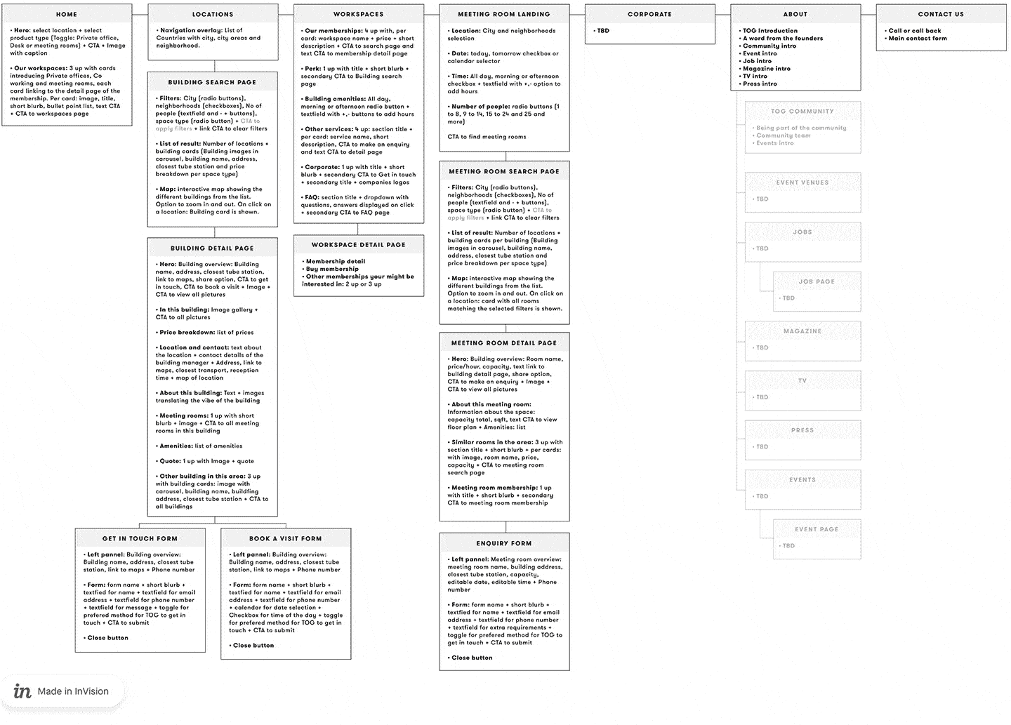
Pictured above: an early revision of the proposed sitemap
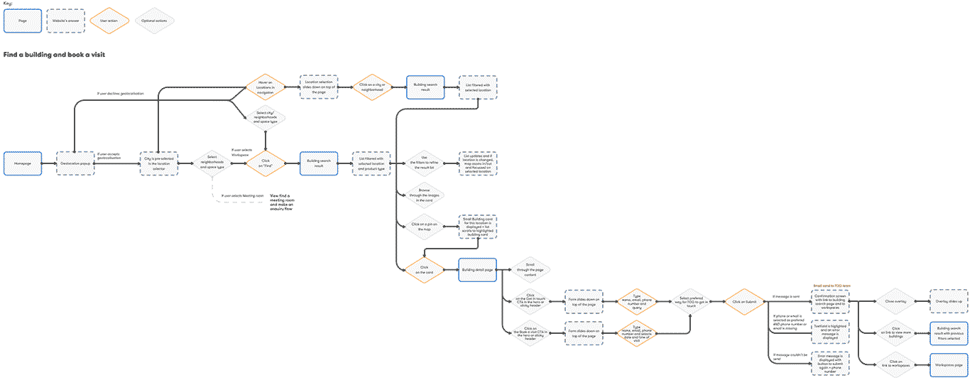
I mapped a user flow based on the new IA that could ‘cater’ for each identified persona.

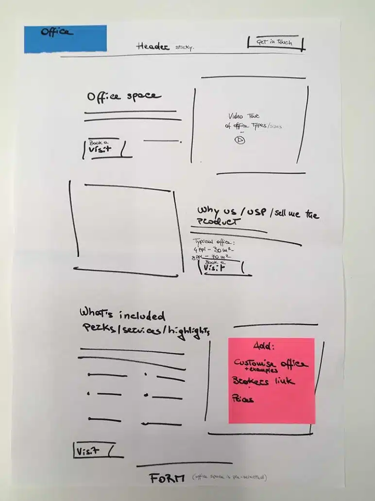
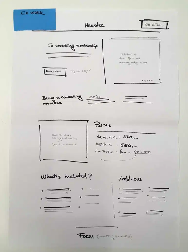
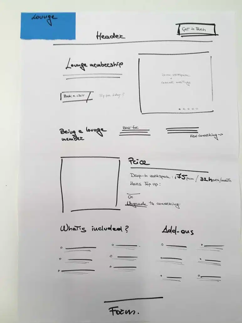
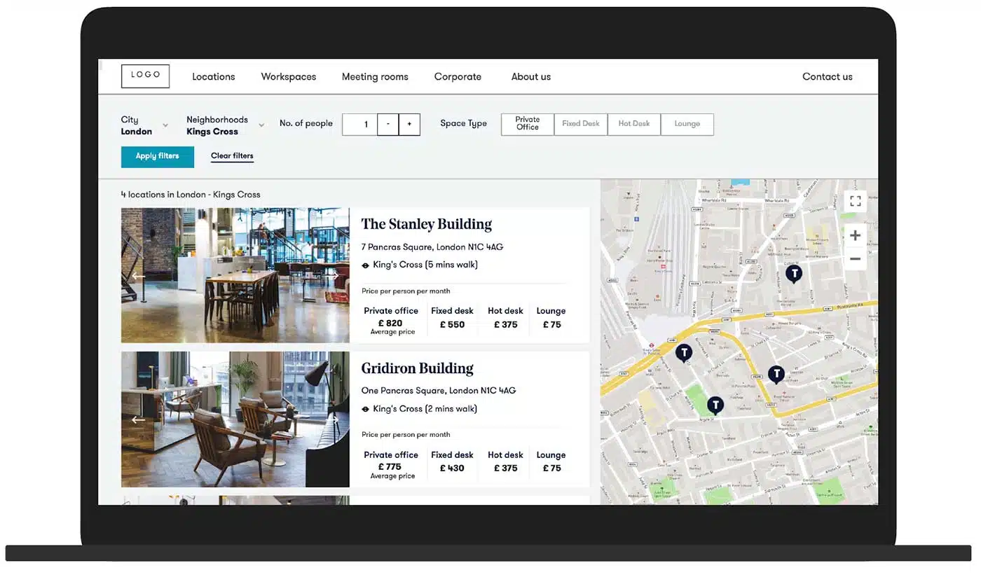
To facilitate usability testing sessions, I developed a fully functional Axure prototype. This prototype was designed to evaluate key aspects such as the user journey, search filters, grid arrangement, map interaction, content, and layout.
Link to prototype: https://cs65by.axshare.com/
Recognizing the absence of pattern libraries or components, I undertook the development of a design system using Atomic Design principles, utilizing tools such as Sketch and InVision.
This encompassed auditing legacy website assets and collaborating with the Content Marketing team to identify essential modules. Upon completion, the design library was integrated into the codebase and maintained on Zeplin and Netlify.
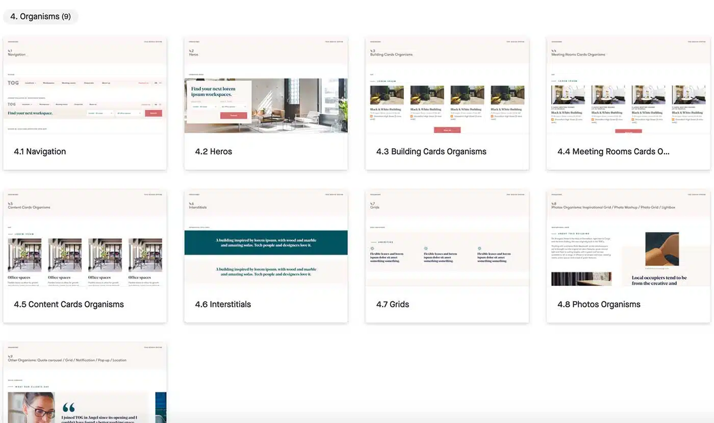
Pictured above: an early revision of the new Design system.


![]()
Airtable to list and track all the components in the design system. Optimal workshop to run card sorting and tree testing the IA.

Invision to document the design system outcomes and the final templates. Axure to create prototype to test with real customers.

Sketch to produce pixel-perfect layouts and the design system, Zeplin to handoff designs to the development team.
If you’d like to find out more about my work and experience, or to discuss potential projects, please get in touch!